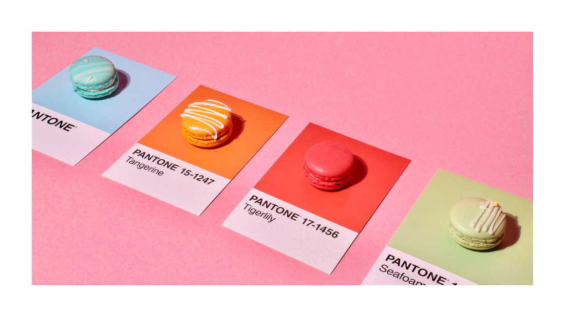
The Psychology of Color in Branding: How to Choose the Right Palette
Color isn’t just about looking pretty—it’s a secret weapon in branding! The colors you choose for your brand can shape how people feel about you, how they remember you, and whether they trust you enough to do business with you. No pressure, right? But don’t worry—we’re here to break it down in a way that makes choosing brand colors fun (yes, really!).
Why Color Psychology Matters
Ever walked into a store and instantly felt cozy and at home? Or scrolled past a website that felt... off, but you couldn’t quite put your finger on why? That’s color psychology at work. Colors trigger emotions, influence decisions, and set the tone for your entire brand vibe.
Think about some of the biggest brands out there:
-
Red (Coca-Cola, Target, Netflix) = Bold, energetic, and attention-grabbing.
-
Blue (Facebook, PayPal, IBM) = Trustworthy, calm, and professional.
-
Yellow (McDonald's, Snapchat, IKEA) = Cheerful, optimistic, and fun.
-
Green (Starbucks, Whole Foods, Spotify) = Natural, fresh, and balanced.
-
Black & White (Nike, Chanel, Apple) = Sleek, sophisticated, and timeless.
Your brand colors tell a story before you even say a word. So, what’s your story?
How to Choose the Right Brand Colors
Let’s get into the fun part—picking the perfect color palette for your brand! Here’s how to do it without pulling your hair out:
1. Know Your Brand Personality
Are you bold and edgy? Soft and minimalist? Playful and quirky? Your brand’s personality should be reflected in your colors. If you’re a wellness brand, neon green might not be the vibe. If you’re a high-end luxury brand, hot pink might feel out of place (unless you’re Barbie, of course).
2. Think About Your Audience
Who are you trying to attract? If your audience is corporate professionals, a calming blue might be the way to go. If you’re targeting fun-loving creatives, vibrant colors could make a stronger impact.
3. Check Out the Competition (But Don’t Copy)
It’s always a good idea to see what your competitors are doing, but your goal is to stand out, not blend in. If everyone in your industry is using blue, maybe you go for a rich purple or a bold orange instead!
4. Stick to a Cohesive Palette
A strong brand typically has:
-
A primary color (your main brand vibe)
-
A secondary color (supports and complements the primary)
-
2-3 accent colors (adds a pop of contrast for emphasis)
Too many colors can feel chaotic, and too few can feel boring. Balance is key!
5. Test It Out!
Before committing, play around with different combinations. Mock up your logo, website, and social media graphics to see how they feel together. Does it give the right energy? Would YOU trust and remember a brand with those colors? If not, tweak away!
Ready to Nail Your Brand’s Color Palette?
If this all feels overwhelming, don’t stress—we’ve got you! Our branding experts are pros at crafting color palettes that actually work. Apply to work with us, and we’ll create a brand identity that’s not just beautiful but strategic (and totally you!).
Click below to start your branding journey with us!

