 Start a Project
Anchor Point
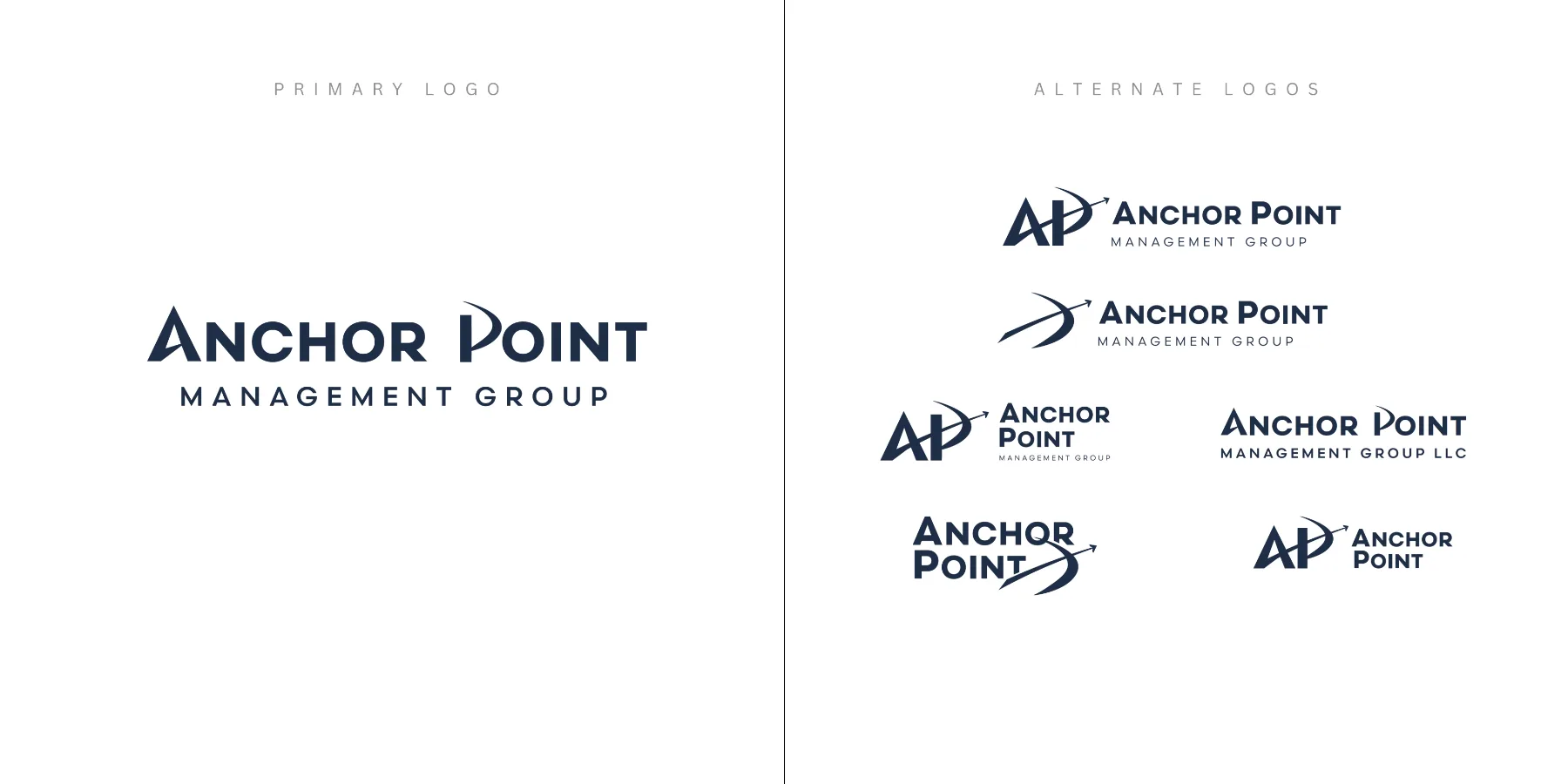
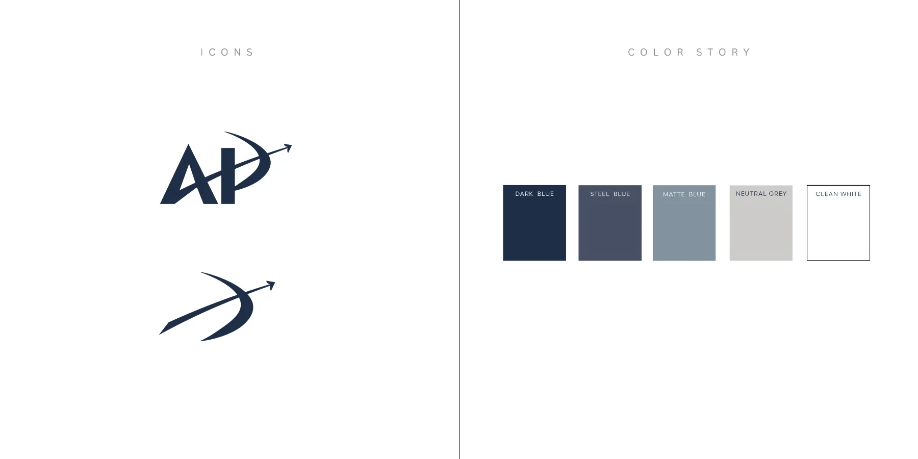
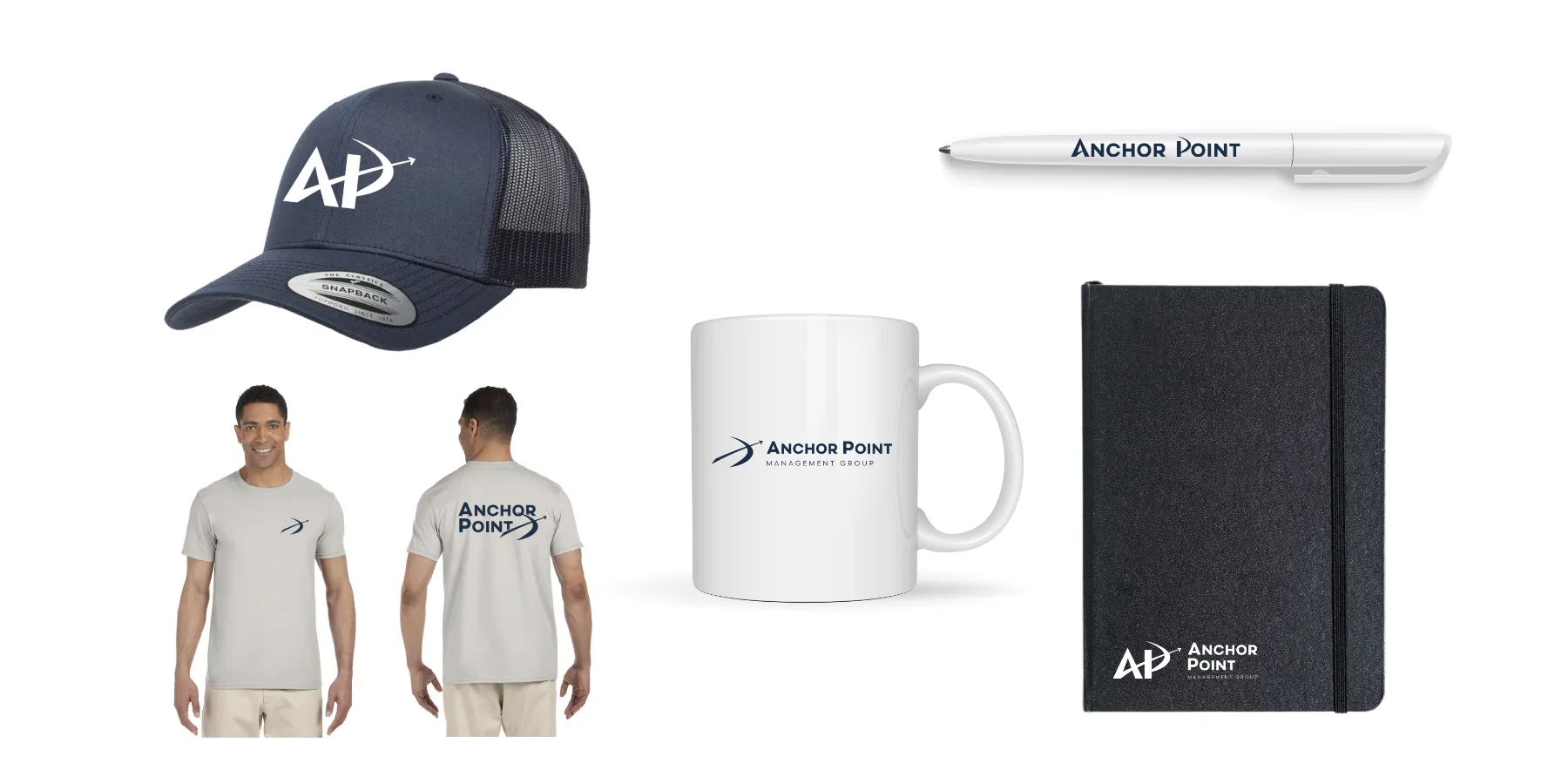
A corporate identity for a major restaurant management group, inspired by the precision, consistency, and forward momentum of an archer's anchor point.
The challenge
When the management group behind roughly 281 Taco Bell and 65 Buffalo Wild Wings locations became Anchor Point Management Group, they needed an identity to establish the new name. The brand had to feel polished and corporate enough for an organization of its scale while giving meaning to the idea of an "anchor point." The challenge was referencing the archery term without creating an identity that felt overly literal or themed.
The approach
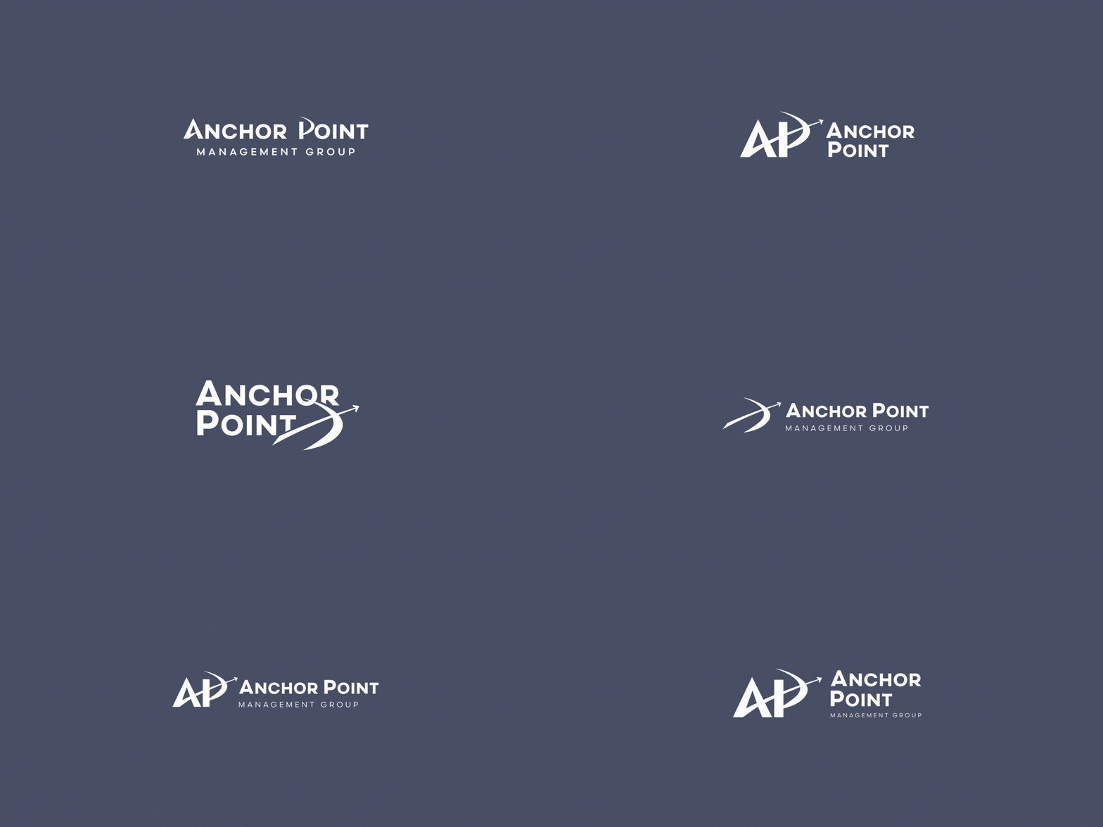
The work drew inspiration from the anchor point in archery — the consistent position an archer returns to before aiming and releasing — as a metaphor for stability, precision, and direction. Rather than illustrating that idea literally, it was translated into a visual system with a sense of forward movement built into the logos and supporting identity. The result gives Anchor Point a professional corporate presence with a deeper story behind its name.


Ready to make waves?
Let's make waves together.
Now booking a limited number of new projects this season. Share a few details about your brand to see if it's a fit.
Get in touch →